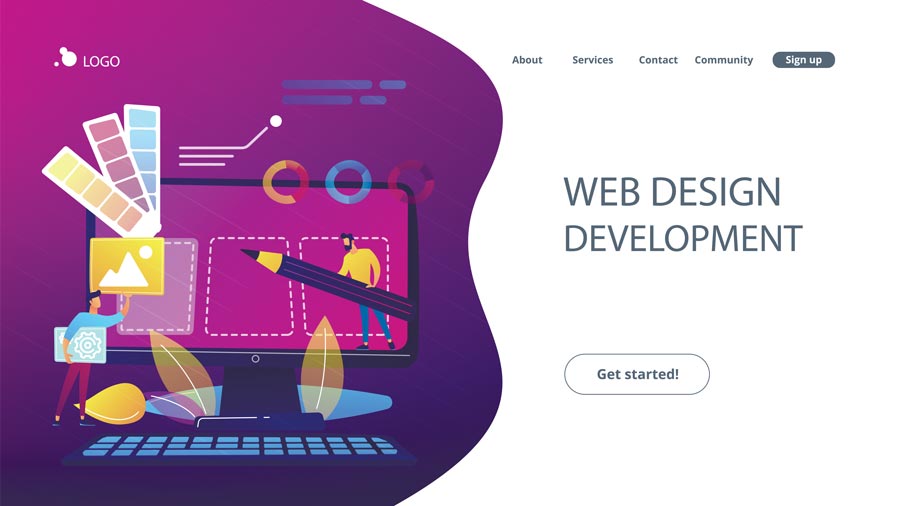
The year 2020 is going to be fantastic for web design; you will see significant differences online. Make sure to pick trends for your website that resonate with your brand or business, don't make your website look a certain way only because of a trend. Do your research and pick the right trends.
Section shape dividers and Geometric shapes
Section shape dividers and geometric shapes are starting to become an essential part of today's web design. This gives the design a unique feel, and with the combination of scrolling effects, it improves the experience of users.

Having a hero video background or zooming effects
Adding zooming effects are lightweight CSS effects and very simple. Using these effects gives a fantastic impression, especially when it is in the first impression. Video backgrounds are becoming very popular; you can share the message when done correctly. The videos tell the visitors what to expect and what the website is about.
Accessibility is a trend after all
We previously wrote about the importance of website accessibility. Making sure that your website is accessible for everyone, is not only a benefit for everyone online, but it's a benefit for your business. If your site is very well designed and is very accessible, then you will make it easy for visitors to interact with your website and to understand your business. If you have happy customers, you will have a higher chance of converting those customers.
Art illustration
The trend in the year 2020 is illustrations in many different styles of web design. The most popular illustrations are not the perfect or the best looking; they are handwritten illustrations so that it brings a connection with your visitors and humanity, especially in the digital world. These illustrations are made to make your website feel homier and appeal to visitors so that they don't get intimidated.

Image: © Visual Generation - stock.adobe.com
Dark mode
The dark mode gives your website a very modern look and helps you to stand out with higher-quality graphics. This will also help you to promote your product more effectively.

Glowing colors and neon theme
In conjunction with dark mode from the tip we talked about previously, luminous colors will give you a website a well-designed look and give it an exciting look that will appeal to your visitors.
One page optimization
Most businesses and websites are sticking to optimizing a single page, as it helps the customers to make the decision quickly. Whenever a visitor has to go through three or four steps before they purchase a product or sign up for a specific thing, they lose interest every time they go through those processes. It's crucial that you optimize your page to a point where the customers don't have to leave your page.
One page optimization is starting to become a big trend, especially in the year 2020. Everything is getting competitive online, which is why it is essential that you optimize your website to a point where the visitors don't have to leave the page.
Minimalist approach
If your website requires you to have specific pages for specific services or products, then you need to make sure that you use a minimalist approach. Everyone in the year 2020, is looking to make their user interface very easy and minimalistic. This means that the more options you have, or the more buttons you have, the harder it will be for you to grow.
Take apple.com as an example. You can see how minimalist their approach is and how they make everything look quality and is easy to use. Make sure to use and mimic apple.com when it comes to making your website.
3D design
3D designs were used in games back in the day, and now they are becoming more popular in the year 2020 for websites. 3D designs can add a sense of realism to your website, and you will see many of the top sites starting to use 3D designs on their homepage and other pages.
If you are going to use 3D design, then make sure to research your market before you do so. Also, pick designs that are going to be congruent with your website, you don't want to put anything you find online on to your site simply because it is 3D.
Image "Design": © rikkyal - stock.adobe.com


